Case · UX Consulting · Merck
A product page system built for trust at every width
One responsive template for 15 regulated vaccine product sites — seven breakpoints, a persistent safety drawer, proven on VAQTA.
01 Results
One template, adopted portfolio-wide, still the standard.
Why it mattered
Every site built alone repeats the same regulated-content problems and pays the same compliance bill. Building the answer into one template meant the portfolio paid it once.
02 The Work
The template at every width, and the brand that proved it.
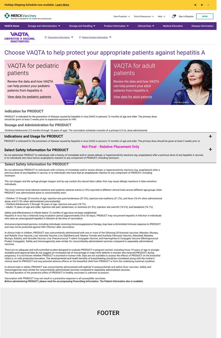
Swipe through the system: the VAQTA product homepage built on the template, then the wireframe specification from 1920px down to a 375px phone.
Fig. 1–8 The VAQTA proof and the seven-breakpoint wireframe specification. Tap any figure to view it full size.
Regulated content accommodated by design, rather than bolted on.
The principle behind the template system
03 Process
Fifteen sites, three audiences, and a compliance bill on every change.
Merck’s vaccine portfolio ran on 15 separate product sites built one at a time. Prescribing information, safety language, and efficacy claims sat in different places at different widths, and every change repeated the compliance cost.
Friction A
Divergent patterns
The same regulated content appeared in different places, in different structures, at different widths on every site.
Friction B
Three audiences, one page
Administrators, practitioners, and patients used the same properties for different reasons — the high-stakes information had to stay legible for each.
Friction C
Compliance cost per change
Product turnover kept content moving, and every site-by-site change carried its own review cycle.
Pitch leadership on a shared system
Presented the case to marketing leadership, ran it as a pilot, then scaled to the full portfolio rather than asking for portfolio-wide commitment up front.
Direct five UX designers
Kept the templates consistent as they were applied product by product across the portfolio.
Specify seven breakpoints
375, 414, 768, 1024, 1280, 1440, and 1920 pixels — each documenting how the header, section cards, and content columns reflow.
Design the docked safety drawer
Indications and Select Safety Information ride in a persistent, expandable drawer, so required content stays on screen at every scroll position and every width.
Validate on VAQTA
Applied the template to a live brand — its own palette, photography, and navigation — to prove the system flexes without breaking.